Digital printing benefits: •Better for lower quantities •Fastest turnaround •No printing plate waste
Getting Colour Right – Screen VS Print
One of the hardest elements to master in printing is aligning what you see on screen to what you get when you print a copy. It’s one of the toughest elements in all of printing to bring under control.
Why is that?
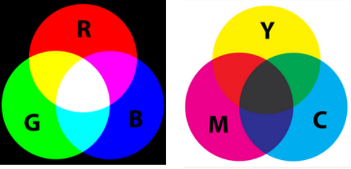
Your computer monitor uses light made up of Red, Green and Blue (RGB). On top of that, different types of screens, different drivers and different graphics cards have a big effect on the actual display, so looking at the same image on different screens comes out differently.
Printing uses inks of Cyan, Magenta, Yellow and Black (C, M, Y, K) on paper to recreate images. (By the way, the K to designate Black was used so as not to be confused with the B of Blue from RGB.) Different printers have different colour settings, and even while calibrated to ensure truest reproduction, output can still look different.
On top of all this, ambient lighting – whether viewing RGB or CMYK – also affects how we see colour, so daylight, artificial light, even time of year, can affect how we perceive things.
Oh – and the paper you print on matters too. Coated papers tend to have brighter colours because they don’t absorb as much ink, and release more reflected light, enhancing overall richness of tone.
So how do you control colour, and ultimately,
the look of your printed piece?
A professional printer and graphics department can work with you to ensure your final piece looks right and reflects your goals. Do you have a spot colour you need to match? Do you have flesh tones you need to improve?
If you need exact colour matching, Pantone spot colour is the way to go.
If you just need a great finished piece, don’t worry about what you see on screen. Print a sample (getting a digital print from your printer is best), and adjust your colour corrections. Repeat these steps until you have the desired output.
If you don’t have the tools to correct colour, trust your printer’s graphics department to get the result you want. Working with a trained specialist really can make all the difference, letting you focus on what you do best.
Finally, no matter what colour testing and adjustments you’ve made along the way, you need to give your file to a quality printer that cares enough to work with you, to understand what your goal is, and to be a partner to see that goal met.
Otherwise, your print piece will still fall flat. And who wants that?
(Not MG, that’s for sure!)
Related Posts