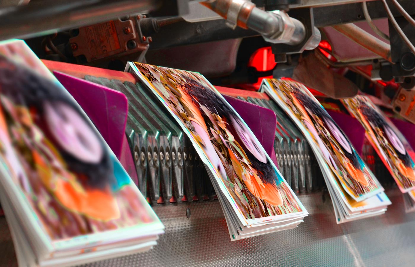
Digital printing benefits: •Better for lower quantities •Fastest turnaround •No printing plate waste
Pantone vs Process Colour Printing
Why doesn’t my colour look right?
You may have run into this problem before – the colour on your screen doesn’t look the same as on paper. Well, to know what printing process to choose depends on the results you’re trying to achieve, the colours you are trying to match, and your budget too.
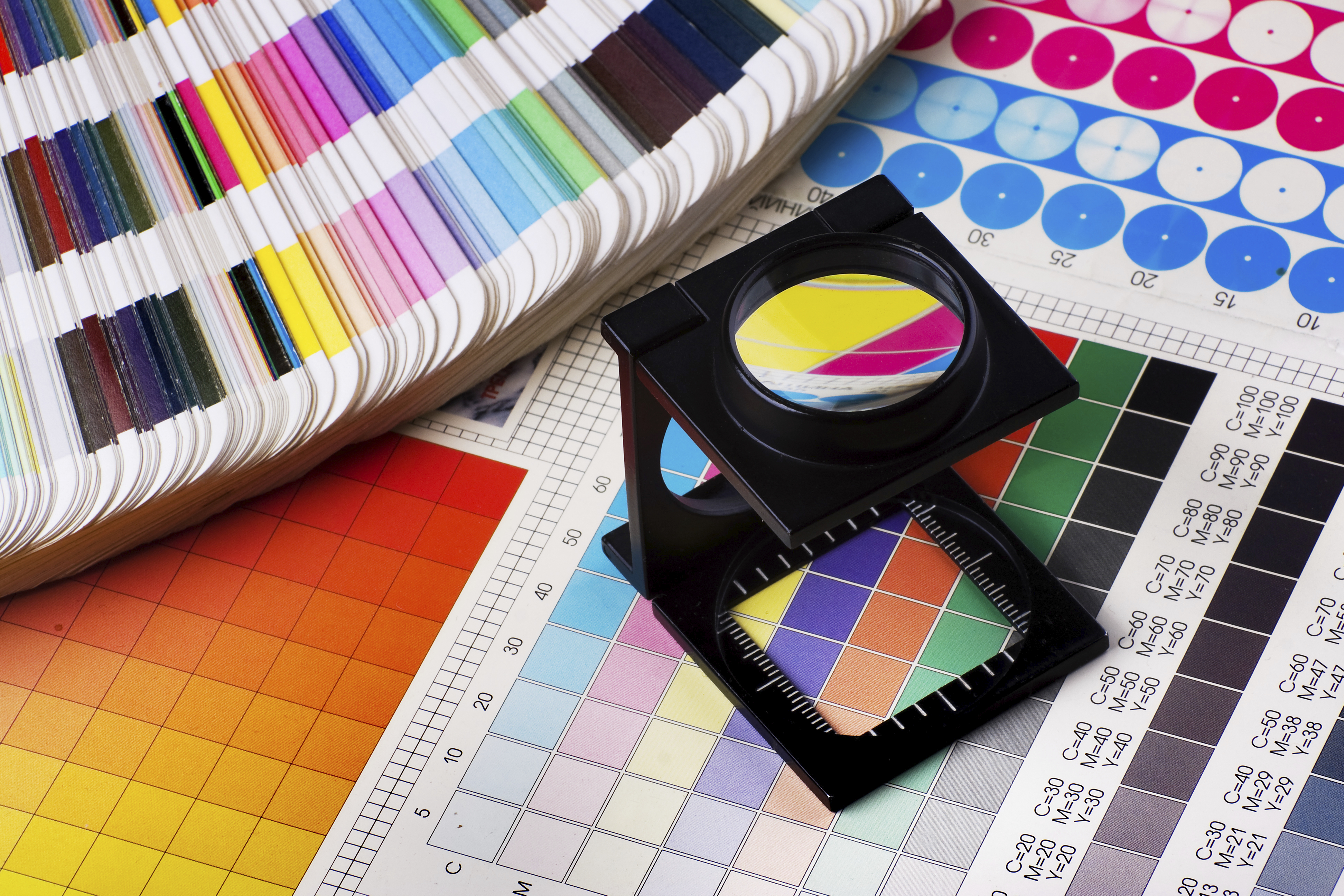
Process Colours
The most common method of achieving color in printing is referred to as CMYK, four–color process, 4/c process or even just process. A file is separated into four different colours: Cyan (C), Magenta (M), Yellow (Y) and Black (K), each of which is made up of small dots, printed at a slightly different angle. The composite image looks like continuous tone.
Because four coloured inks make up all the colour you see on your print piece, this is often the most economical way to go.
However, if you want very vibrant colours, or if you have to match a specific branded colour exactly, then using the Pantone Matching System might be the way you need to go.
Pantone Colours
Each of the spot colors in the PANTONE MATCHING SYSTEM(R) is mixed according to its own unique ink mixing formula developed by Pantone(R). This allows for some very bright colours – orange or royal blue, for example – that 4/c process printing just can’t compete with for brilliancy. Pantone also is the way to go if you want to print a metallic or fluorescent colour.
However, if you’re not a big corporation, printing with more than 3 spot or Pantone colours can really add up.
So What’s Best?
Both are very reliable processes, and both can give you quality results. It all depends on what outcome you want. MG’s trained design team is used to handling PMS to CMYK colour conversions, so we can show you an estimate of what your final piece will look like and give you great advice on what’s the best process to use.
Talk to us if you have any questions about the best way to proceed – to ensure that all your print pieces look great.
Oh, and did we mention that the kind (and colour) of paper that you print on also further affects colour? If your paper is coated or uncoated, the ink looks different yet again! But that’s a story for another time.
Cheers!
Your MG Team
•For more information on Pantone vs Process Colour, visit: http://www.pantone.com/spot-vs-process-color
•Have questions? Want to know more about another helpful topic? Leave your comments below.
Related Posts